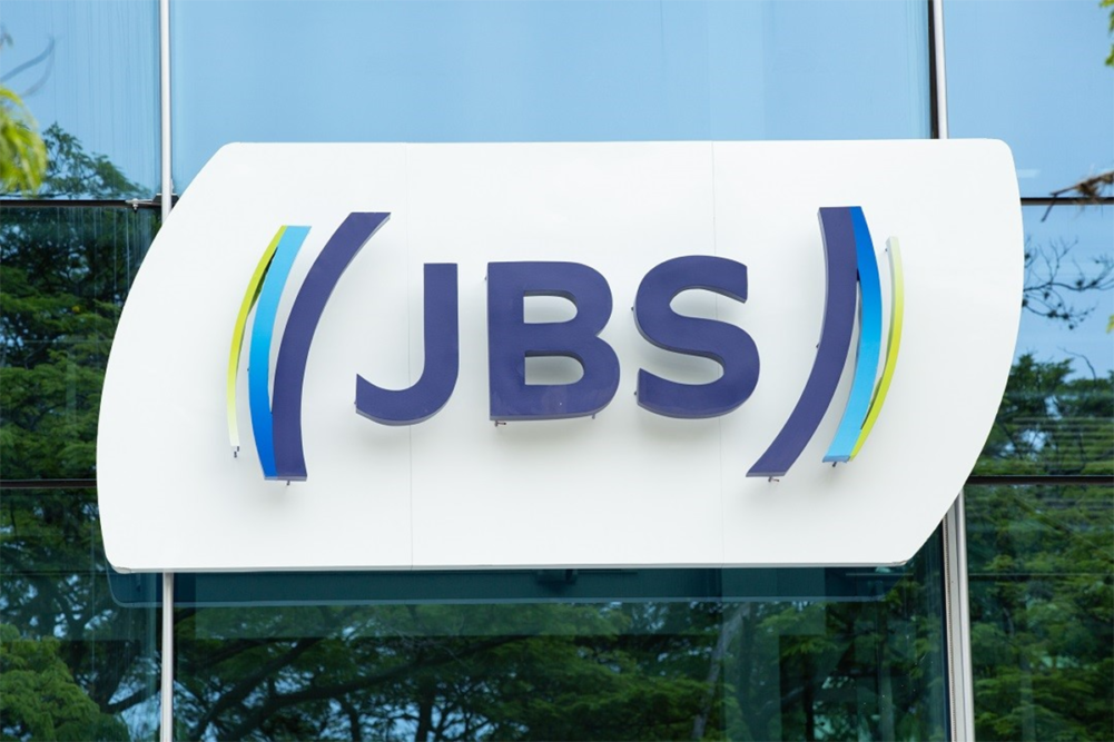
SÃO PAULO — Marking its 70th year of operations, Brazilian meatpacker JBS S.A. is modernizing its brand identity with a new design and colors. Beginning on Oct. 16, JBS launched its new look outside the company’s headquarters in São Paulo, Brazil. Over time, the new design will gradually make its appearance across all JBS units.
The rebranding has been under development for three years through a partnership with FutureBrand.
The new logo features the traditional three letters of the company’s name but adds a series of parentheses as a visualization of the company’s future, which is being built with solid investments and innovation, JBS said. The parentheses themselves act as a symbol of hands, protection and affection between JBS and its customers and consumers.
JBS said the inner parentheses are a solid blue tone to represent the company’s robustness to its partners, employees and stakeholders. Next along the movement in the parentheses are several other shades of blue, which symbolize the variety of proteins and geographies in which JBS is present. The outermost set of parentheses is green to represent the company’s commitment to environmental, social, operational and economic sustainability.
Founded in 1953 as a small butcher shop in Goiás, Brazil, JBS has grown to be one of the largest global food companies.
“We started from a small meat house in the interior of Brazil and became one of the largest food companies in the world,” said Gilberto Tomazoni, global chief operating officer of JBS. “We are a multi-protein and multi-geographic company, with more than 270,000 employees, in more than 20 countries. We have evolved a lot, especially in the last decade, so it is natural that our brand evolves too.”


